FRENCHIE’S

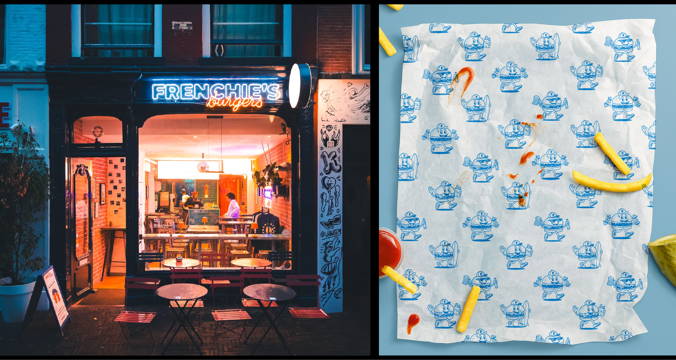
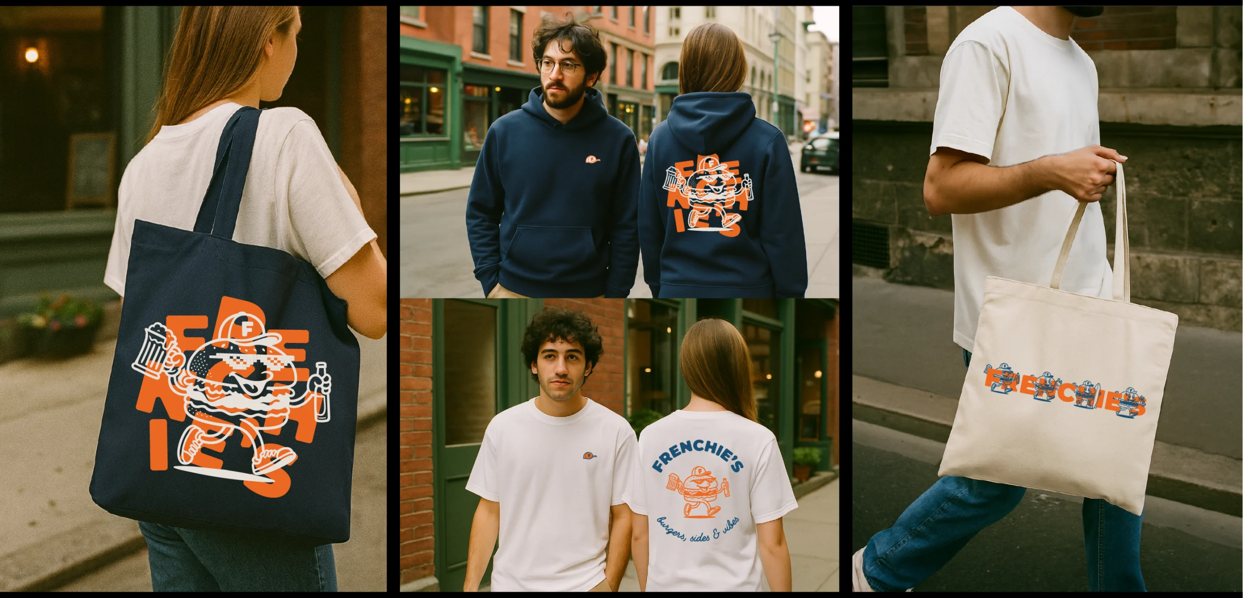
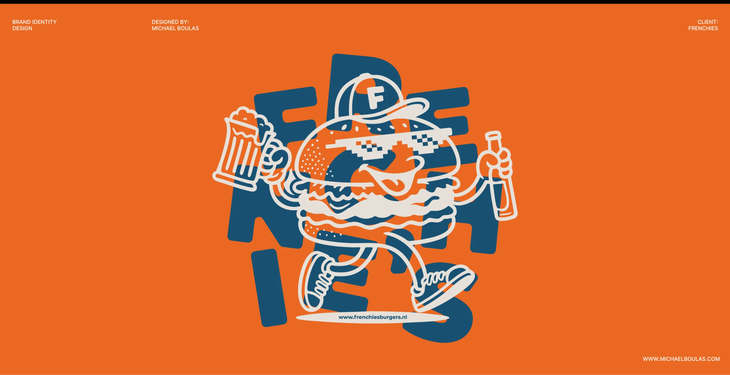
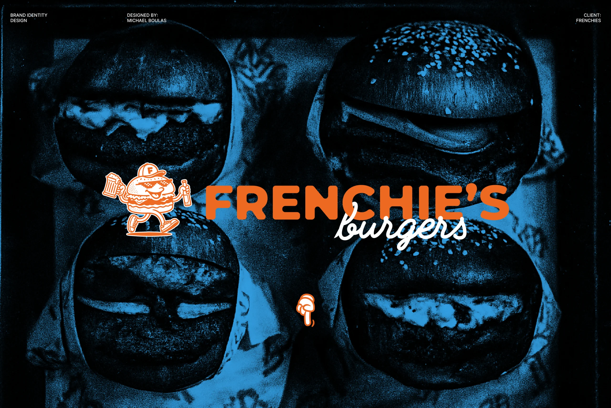
A playful burger brand built on quality, character, and care.

I worked with two French friends who brought their background in high end hospitality into a simple idea: making really good burgers without the fuss. They wanted a place in The Hague that felt easy and welcoming, but where quality was still taken seriously.

The main challenge was getting the balance right. Frenchie’s needed to be fun and full of character, without feeling silly. Confident, but not stiff. Something that felt considered, but not overly designed.

The identity leans into that balance. Playful, character driven illustrations bring personality and humour, while a cleaner visual base keeps everything grounded. Custom typography adds a recognisable voice, and analogue inspired photography brings warmth and texture, helping the brand feel relaxed, human, and familiar.

Everything was designed to work as a flexible system, so the brand could live comfortably across packaging, social content, posters, merchandise, and in store touchpoints without losing its charm. The result is a burger brand that feels confident and inviting, with just enough edge to stand out.

This project represents an updated evolution of an earlier rebrand, refining the original idea and expanding it into a more complete visual system.